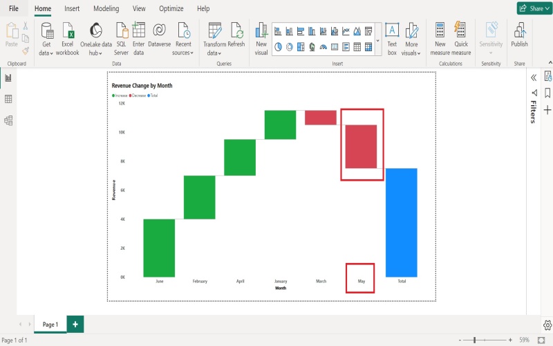
In today’s data-driven world, speaking the language of data visualization is crucial. The waterfall chart is an indispensable tool that assists analysts, managers, and executives in making sense of complex data. In this article, we’ll delve into what a waterfall chart is, use cases, and best practices. Keep reading to learn more.
Understanding the Waterfall Chart
The waterfall chart, or bridge chart, is a data visualization tool. It helps in understanding the cumulative effect of sequentially introduced data. Especially useful in financial data analysis, it shows how initial value increases or decreases due to several factors.
You can quickly identify these factors on the X-axis, while the Y-axis represents quantitative values. The bridging effect provides a visual connection from one data point to another, giving the chart its waterfall moniker. In this respect, it’s significantly different from other data visualization tools.
One of the notable benefits of using a waterfall chart is its clarity in understanding the contributing factors to the overall change. It breaks down the variance between an initial and an end value in an easily digestible manner.
For example, a company might want to understand the factors contributing to its revenue growth. A waterfall chart could visually segregate these contributing elements, such as new customer sales, upsells, cross-sales, etc.
Primary Functions of a Waterfall Chart
The primary function of a waterfall chart is to highlight how an initial value changes due to various factors. It effectively visualizes the step-by-step sequential build-up or breakdown of values.
Waterfall charts are widely used in corporate finance to visually show individual components’ positive or negative impact over time. The key idea behind these charts is to showcase how each division, region, or product contributes to the company’s overall performance.
Another core function is disproportionately emphasizing the positive or negative aspects of the data under consideration. For example, a company struggling with financial bleeding can utilize a waterfall chart to highlight the factors contributing most to losses visually.
Diverse Uses of Waterfall Charts in Different Industries
Alt text: A team sitting around a table discussing the benefits of waterfall charts, with an image of a waterfall behind them.
Waterfall charts carry universal value and are widely utilized across different industries. For instance, they provide a detailed breakdown of cost components, revenue sources, and other financial metrics in finance.
In supply chain management, waterfall charts can illustrate the cumulative time spent in various stages of product production and delivery. They’re also extremely helpful in project management, where they can visualize the impact of different tasks on overall project time.
Waterfall charts are invaluable in the sales domain, too. They can express how various products and services contribute to total sales and track progress toward sales targets over various periods.
In a nutshell, waterfall charts’ potential applications stretch as far as your imagination can take you. This makes them a universally popular choice for data analysis and visual storytelling.
Implementing Best Practices for Waterfall Charts
Like any other data visualization technique, success with waterfall charts depends on implementing the best design, categorization, and interpretation practices. One such practice is effectively using color codes to denote positive and negative changes.
Ensuring consistent scale is crucial to avoid misleading visuals. A misleading chart is harmful as it can lead to inaccurate decisions. Hence, it’s critical to maintain uniformity in scale across all bars to infer results better.
Annotating your chart can greatly enhance its effectiveness. Annotations could be as simple as labels or as detailed as short narratives describing what transpired between data points.
Lastly, simplicity is the ultimate sophistication. Avoid clutter and aim for a clean, intuitive chart where the data speaks for itself. It’s always important to remember that the goal of a waterfall chart is to simplify information, not to complicate it.
The waterfall chart is an extremely potent tool in data visualization. Its ability to crystalize complex data into digestible graphical representations instrumentalizes data interpretation and decision-making.

